01
Challenge
The website needed to make frozen snacks look exciting while still communicating quality, trust, and convenience.
FOOD & FROZEN SNACKS WEBSITE
Timeline
Website UI/UX Design
Role
UI/UX Designer
Focus
Outcomes
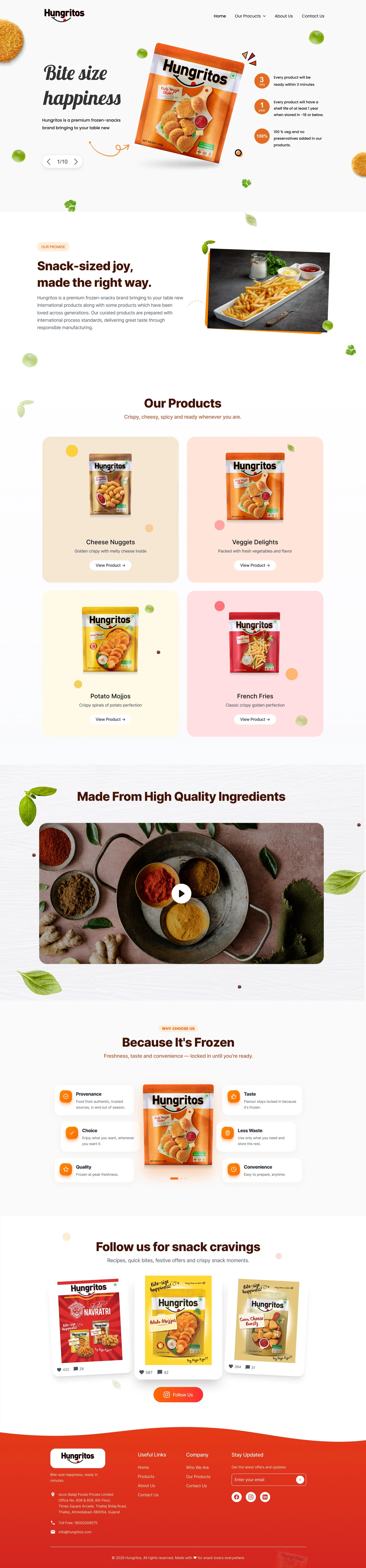
Hungritos is a frozen snacks brand website designed to showcase its bite-sized products, highlight ingredient quality, and create a fun, appetising digital experience for users exploring ready-to-cook snack options.
Synopsis
Frozen food websites need to do more than display products. Users need to quickly understand what the brand offers, why the products are trustworthy, and what makes them appealing. The challenge was to design a website that makes Hungritos feel fun, modern, and snackable while keeping product discovery simple and clear.
Design Process
Discover
Understood the brand, product range, visual tone, and how users explore frozen snack products online.
Define
Mapped the key website goals: brand recall, product visibility, ingredient trust, and easy navigation.
Ideate
Explored playful layouts, product cards, food visuals, ingredient sections, and social media-led content blocks.
Design
Created a bright, clean website experience with bold product visuals, soft colours, snack-inspired elements, and clear CTAs.
Review
Checked the flow for readability, product clarity, visual balance, and mobile-friendly structure.
Handoff
Prepared final website screens, reusable sections, and design-ready assets for development.
Research Insights
Food websites need strong visuals because users decide quickly based on appetite appeal.
Product discovery should be simple, especially when the brand has multiple snack categories.
Trust can be built through ingredient quality, frozen freshness, and clear product communication.
A playful tone helps make the brand feel more memorable and consumer-friendly.
Opportunity Map
Attract
Use bold product visuals and playful design to create instant appetite appeal.
Discover
Make snack categories easy to browse through simple product cards.
Trust
Highlight ingredients, frozen quality, convenience, and product benefits.
Engage
Use social content and snack-led storytelling to keep the brand feeling active and relatable.
User Persona
Riya Sharma
26 · Working Professional
Goals
Frustrations
Their words
“I want snacks that look tasty, feel convenient, and come from a brand I can trust.”
User Stories
As a user, I want to quickly understand what Hungritos offers so I can explore products easily.
As a snack buyer, I want to see product visuals clearly so I know what looks appetising.
As a cautious customer, I want to understand the quality and ingredient story before trusting the brand.
As a social-first user, I want to see brand content and snack ideas that feel fun and relatable.
User Journey Map
Discover
neutralActions
User lands on the homepage
Understands the brand through the hero section
Pain points
Needs immediate appetite appeal and a quick sense of what the brand sells
Explore
neutralActions
Scrolls through product categories
Checks nuggets, fries, veggie delights, and potato snacks
Pain points
Too many snack categories can feel cluttered without clear cards
Build Trust
neutralActions
Views ingredient quality
Reviews frozen benefits and product sections
Pain points
Needs reassurance about quality and frozen-food trust
Engage
positiveActions
Checks social posts
Explores snack cravings and brand content
Pain points
Brand personality should stay active beyond product listings
Take Action
positiveActions
Moves toward product enquiry
Follows the brand or reaches contact
Pain points
The next step should stay light and easy rather than sales-heavy
How Might We
How might we make frozen snacks feel more fun and appetising online?
How might we help users explore product categories without clutter?
How might we build trust around frozen food through design and content?
Problem Statement
Hungritos needed a website that could present its frozen snack range in a more engaging, trustworthy, and easy-to-browse format. The experience had to balance appetite appeal, product clarity, and playful brand storytelling.
Hypothesis
If the website uses strong product visuals, simple product cards, ingredient-led trust sections, and playful snack-focused design, users will understand the brand faster and feel more interested in exploring the products.
Value Propositions
Snack-first Visual Design
Large product visuals and playful food elements create instant appetite appeal.
Clear Product Discovery
Product cards help users browse different snack options quickly.
Trust Through Ingredients
Ingredient and frozen-quality sections help communicate freshness, taste, and convenience.
Playful Brand Experience
The website uses a fun tone, soft colours, and social content to make the brand feel memorable.
Competitive Scan
Frozen Food Brands
Strong product focus, but many websites feel catalogue-heavy.
Snack Brands
Playful and visual, but often less focused on ingredient trust.
D2C Food Websites
Good storytelling, but sometimes overloaded with offers and purchase CTAs.
User Flows
Website Flow
Product Discovery Flow
Behind the work
Challenge
The website needed to make frozen snacks look exciting while still communicating quality, trust, and convenience.
Approach
I used bold product packaging, food-inspired colours, playful floating elements, simple product cards, ingredient visuals, and clear section hierarchy.
Result
The final design feels fun, appetising, and easy to explore while giving Hungritos a stronger digital brand presence.
Deliverables
Focus areas
Project type
FOOD & FROZEN SNACKS WEBSITE
Timeline
Website UI/UX Design
Deliverables
8 items
Platform
Web
Full Website View
The final website combines playful brand storytelling, product discovery, ingredient trust, frozen-quality messaging, social content, and contact touchpoints in one appetising brand experience.