01
Challenge
The website had to communicate financial expertise while staying approachable and easy to scan.
FINANCIAL ADVISORY WEBSITE
Timeline
Website UI/UX Design
Role
UI/UX Designer
Focus
Outcomes
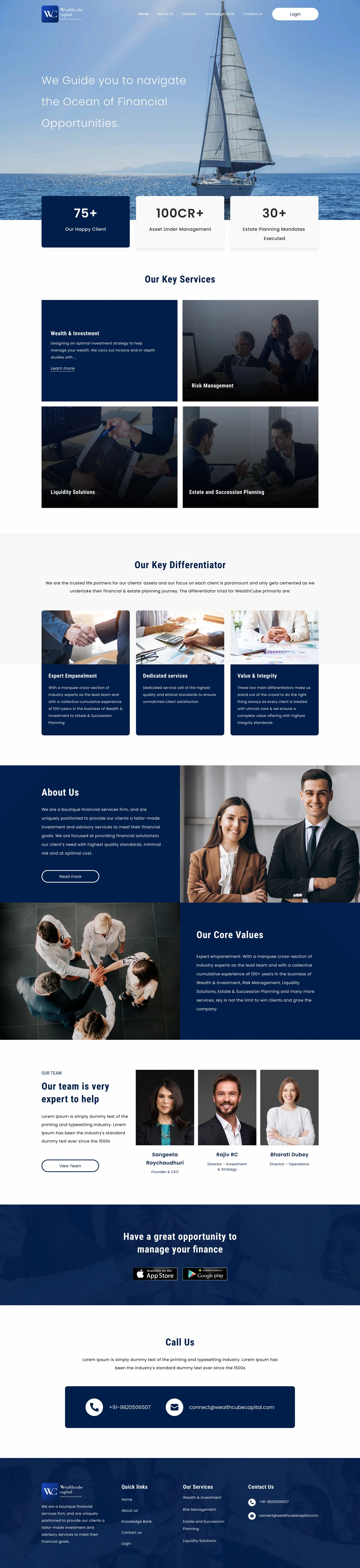
Wealthcube Capital is a financial advisory website designed to help users explore investment, wealth management, risk management, liquidity solutions, and estate planning services through a professional and trust-focused digital experience.
Synopsis
Financial advisory websites need to build trust quickly. Users want to understand the company's expertise, services, values, and contact options before starting a conversation. The challenge was to design a website that feels premium, credible, and easy to navigate while communicating complex financial services in a simple and structured way.
Design Process
Discover
Understood the brand positioning, financial service categories, target audience, and trust-building requirements.
Define
Mapped key website goals: service clarity, credibility, expert positioning, and enquiry generation.
Ideate
Explored layouts for hero sections, service cards, differentiators, about sections, team profiles, and contact CTAs.
Design
Created a clean finance-focused interface using a navy visual system, strong imagery, clear hierarchy, and premium spacing.
Review
Checked the experience for readability, trust, navigation flow, and professional tone.
Handoff
Prepared final website screens, reusable sections, and design-ready assets for development.
Research Insights
Finance users need credibility before they engage.
Services must be explained simply without overwhelming the user.
Stats, team profiles, and differentiators help build confidence.
Clear contact options are important for users ready to speak with an advisor.
Opportunity Map
Build Trust
Use strong visuals, service proof, team profiles, and clear company values.
Explain Services
Make wealth, investment, risk, liquidity, and estate planning services easy to understand.
Showcase Expertise
Highlight experience, client numbers, AUM, and advisory focus.
Drive Enquiry
Guide users toward call, email, or app download actions.
User Persona
Arvind Mehra
42 · Business Owner / Investor
Goals
Frustrations
Their words
“I need to know they are credible before I trust them with my financial planning.”
User Stories
As a potential client, I want to understand the services clearly so I can decide if they are relevant to me.
As an investor, I want to see credibility indicators before contacting the firm.
As a user, I want to learn about the team so I know who I may be working with.
As a visitor, I want an easy way to call or contact the company.
User Journey Map
Discover
neutralActions
User lands on the homepage
Understands the financial advisory positioning
Pain points
Needs an immediate sense of credibility and advisory focus
Explore
neutralActions
Checks key services
Reviews wealth, risk, liquidity, and estate planning options
Pain points
Financial services can feel overwhelming if not grouped simply
Validate
neutralActions
Reviews differentiators
Checks values, team profiles, and credibility numbers
Pain points
Trust markers need to appear before the user reaches out
Decide
positiveActions
Evaluates whether the firm feels trustworthy
Assesses relevance to their needs
Pain points
The website must stay premium without becoming too text-heavy
Contact
positiveActions
Clicks call, email, login, or app download CTA
Takes the next step
Pain points
Contact options should be obvious and low-friction
How Might We
How might we make financial advisory services feel simple and trustworthy?
How might we communicate expertise without making the website feel too text-heavy?
How might we guide users from service discovery to contact with less friction?
Problem Statement
Wealthcube Capital needed a website that could present its financial advisory services in a premium, credible, and easy-to-understand way. The experience had to build trust while helping users explore services, understand value, meet the team, and contact the company.
Hypothesis
If the website uses clear service sections, credibility markers, professional visuals, and simple contact paths, users will feel more confident exploring Wealthcube Capital's advisory services.
Value Propositions
Clear Service Discovery
Financial services are grouped into simple sections so users can quickly understand what Wealthcube offers.
Trust Through Credibility
Stats, expert profiles, values, and differentiators help establish confidence.
Premium Brand Experience
A navy-led visual system, professional imagery, and strong spacing create a mature finance-focused look.
Easy Contact Journey
Call, email, login, and app download CTAs make the next step easy to find.
Competitive Scan
Wealth Management Firms
Credible and professional, but often text-heavy and less visually engaging.
Investment Advisory Websites
Strong service communication, but sometimes lack emotional trust-building.
Fintech Platforms
Modern and clean, but may not always feel personal or advisory-led.
User Flows
Website Flow
Contact Flow
Behind the work
Challenge
The website had to communicate financial expertise while staying approachable and easy to scan.
Approach
I used a premium navy colour palette, clean service blocks, strong imagery, credibility stats, team cards, and focused CTA sections.
Result
The final website feels professional, trustworthy, and structured, helping users understand the brand and move toward enquiry with confidence.
Deliverables
Focus areas
Project type
FINANCIAL ADVISORY WEBSITE
Timeline
Website UI/UX Design
Deliverables
10 items
Platform
Web
Full Website View
The final website brings together service discovery, credibility markers, differentiators, team trust signals, app CTA, and contact actions in one premium finance-focused experience.